OCCRP often publishes investigations that are complex, involving locations around the world and many different parts to a larger puzzle. What is your process for visually representing these stories?
A: It is different every time but it always involves collaborating with the editorial team working on the project. I have to feel the idea behind the stories and find the same visual language to match. Often, an editor has a clear idea, but it’s unspecific at the same time. For the Pegasus Project — stories which involved governments secretly spying on their own citizens — I looked at a typical Pegasus logo and thought that might work. But Deputy Editor in Chief Julia Wallace said the visuals should be darker, not so direct, and portray something not understood completely. I came up with an eye symbol, which has many meanings throughout history, including as a way to see inside someone’s soul. Here, it was meant to show how someone might see inside your private life to control you. It took us two days to decide on the eye and I had one week in total to create 10 illustrations for the stories from places like Mexico, Azerbaijan, and Kazakhstan. It was a true pleasure! I like to test myself and challenge myself creatively.

Illustrations from Pegasus Project, an investigative project led by Forbidden Stories

What medium do you work in?
I use the Procreate digital art program on my iPad. It is the same idea as traditional art — I work on the image, focusing on dark and light, contrast, depth, etc. I taught myself how to use the digital program and initially, it was odd not to feel paint on my fingers. But it was exciting to discover how quickly I could manipulate an image, which helps with quick turnarounds and deadlines.
OpenLux just won an “EPPY” Award from Editor & Publisher magazine and the judges praised the series as “stylish.” How do you reconcile the beauty of art with some of the very dark themes in many of our stories?
Art exists to give people hope and that is one of my ambitions with these story images.
OpenLux was a straightforward series of stories about hiding wealth and the ultimate beneficial owners of companies registered in Luxembourg. Paul Klee’s painting “Castle and Sun” (lower right) was the inspiration for these illustrations. The lines in the painting reminded me of stained glass windows in older European houses and the red colors made me think of the saying, “Money is the lifeblood of the economy.” I used both of these things for the Luxembourg skyline, which became the theme in each image. I then added elements from a country’s currency, depending on the location for each OCCRP story. Paper money usually portrays the most powerful symbols of each country, so a bird, ship, animal, or portrait cuts across the Luxembourg skyline to match the narrative of the story. The design of €500 becomes the “sky” and the “earth” in this world of money.

Illustration from OpenLux, an investigative series led by OCCRP and LeMonde

Paul Klee’s “Castle and Sun”
Building the images for the Semlex series reminded me of cooking with different ingredients. The series is about a Belgium-based biometrics company that used bribes and kickbacks to get contracts around the world. For the background I used a door and kept adding images, layer by layer, until the door is unrecognizable but serves its purpose. The last layer contains the main symbols we want people to see — the fingerprint, the passport — almost like putting garnishes on top of a tart. The colors impart information; each color has an effect on the body and makes people feel something. The blue and red used here are meant to evoke a lifeless place where there is no sun and man is part of the machine, a cold environment.
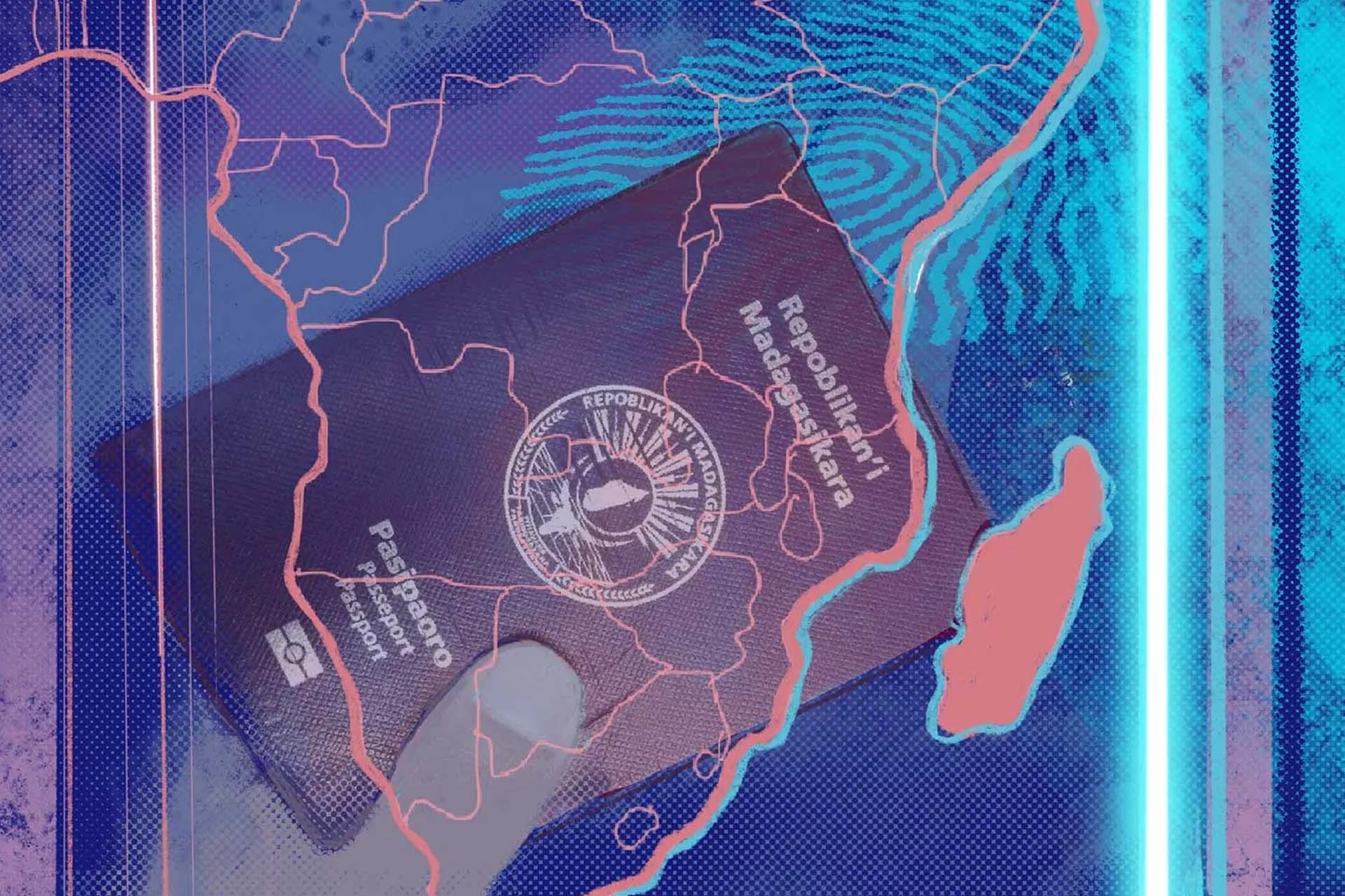
Illustrations from OCCRP’s series into Semlex, a Belgian multinational

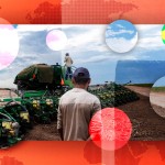
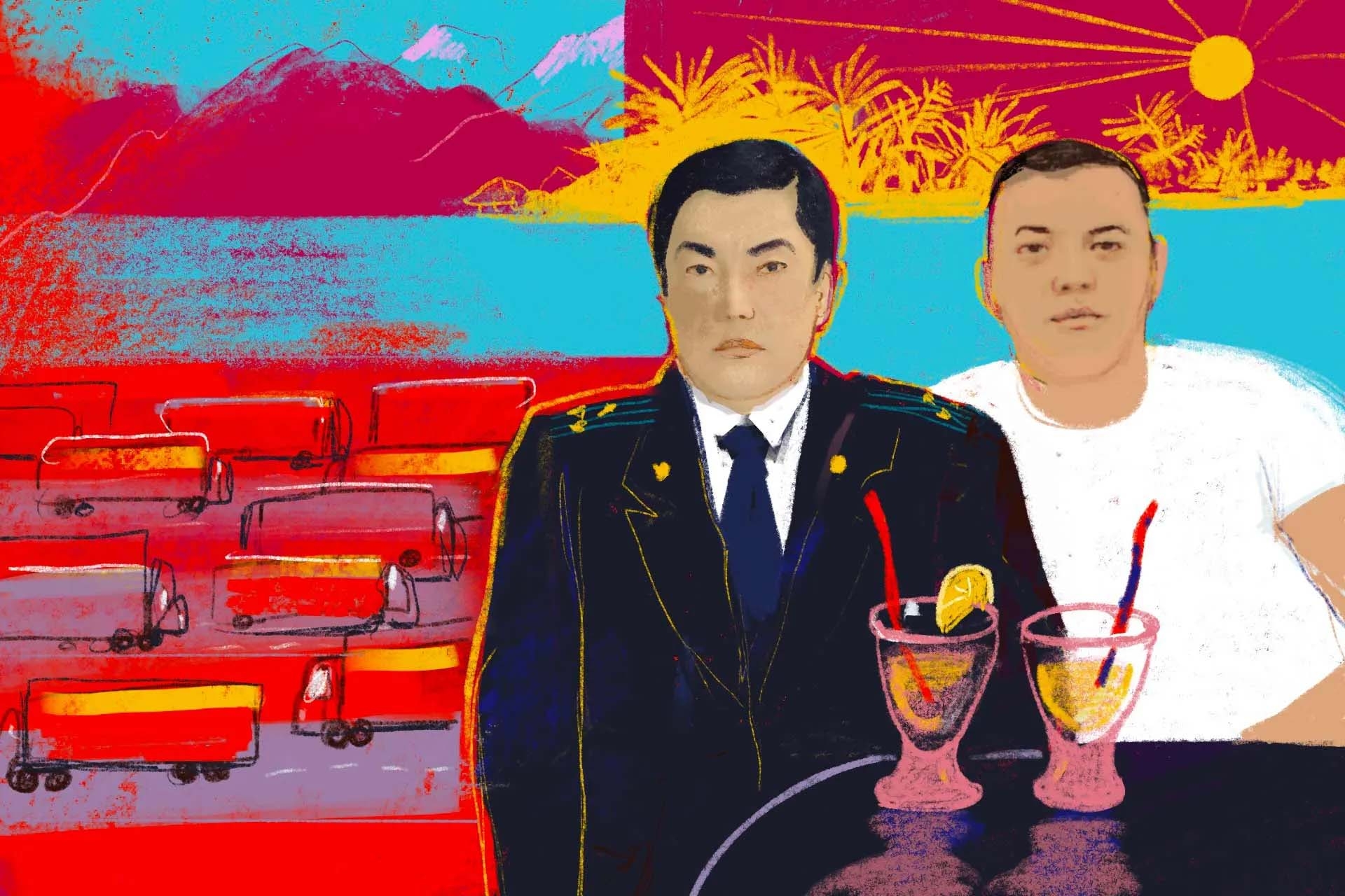
The color scheme in the Matraimov Kingdom was created after a discussion with Senior Editor Ilya Lozovsky. He came to me after they had won a prize for the first set of stories about grand corruption in Kyrgyzstan. He said more stories were coming and he really wanted the images to stand out and be as strong as the reporting. So I used the red and yellow colors from the Kyrgyzstan flag to create a bold style to use throughout, 10 illustrations in all.

Illustrations from OCCRP’s Matraimov Kingdom series
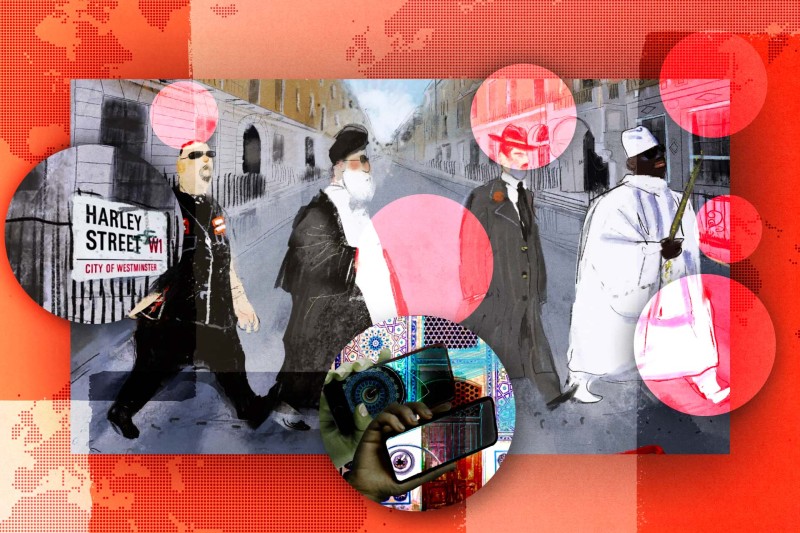
OCCRP’s Twitter followers may not realize one of your illustrations was used as our header image for years. What’s the story behind that image?
This illustration is special to me because it was my first for OCCRP and opened up this whole new world — creating art for investigative journalism. It is from the #29Leaks investigation about a U.K. company services firm regularly exploited by criminals.
I had to portray real people in a recognizable way and chose a cartoon style. Investigative Editor Kira Zalan had the idea to replicate the famous photograph of the Beatles crossing Abbey Road for that album cover. The figures represent a Swedish Hells Angels boss, an Iranian state oil company, the Italian mob, and a fake Gambian bank — all of which used this company featured in the investigation.
There were lots of interesting details to work on — the costumes, the street, the London sky, the architecture. I chose to keep a grayish palette to show the seriousness of the business world and to complement the OCCRP website colors of deep red, black, and white.

Illustration from OCCRP’s 29 Leaks series